The challenge
Stand out in a specialty coffee market where every brand competes on the same minimal, light aesthetic.
The approach
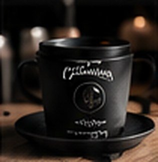
We leaned into contrast — an all-black identity with crisp white type, cups and bags designed to be photographed, and a content style built on low light and texture.
The outcome
A cup people want to be seen holding, and a feed that is instantly recognisable in a scroll.

Next project
Wrap & Go
Let’s
create
something
great.
Get in touch
Want results
like these?
Let’s talk about what we could build together.
Contact me